10 Inspiring Color Palettes for Wedding Perfection in 2026
27 min
10 Inspiring Color Palettes for Wedding Perfection in 2026
Author
The ItsaYes TeamAuthor
Choosing your wedding colors is more than just picking pretty shades; it’s the foundational decision that crafts the entire mood and atmosphere of your special day. From romantic and soft to bold and dramatic, the right color palette for your wedding ties together every visual detail, creating a cohesive story from invitations and floral arrangements to bridesmaid dresses and table linens. It’s the visual language that communicates your unique style as a couple.
But with endless inspiration flooding your screen, how do you translate a dream into a clear, actionable plan? That’s where organization meets inspiration. Instead of juggling spreadsheets, Pinterest boards, and scattered notes, a platform like ItsaYes brings your vision, tasks, budget, and timeline into one calm, intuitive workspace. You begin by defining your style, and the platform helps turn that inspiration into manageable steps.
This guide moves beyond just pretty pictures. We break down 10 professionally curated color palettes for weddings, many of which you can find on our ItsaYes wedding color palettes page, complete with practical application tips and expert pairing advice. Our goal is to help you confidently select a palette and see how to bring it to life. If you’re looking for even more tailored ideas, our wedding color palette generator can create a custom scheme based on your preferences. Let’s dive in and find the perfect combination to define your celebration.
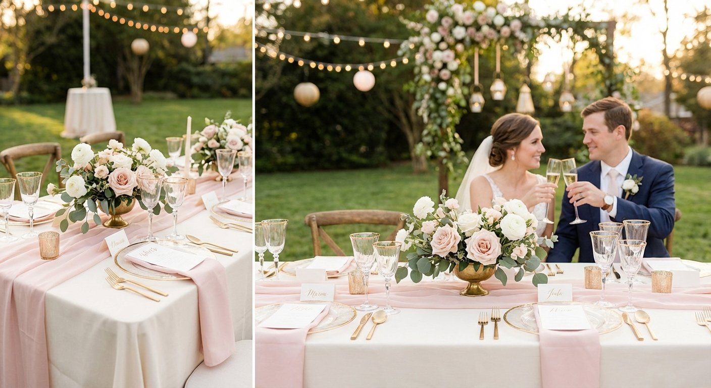
A quintessential choice for spring and summer nuptials, the Romantic Blush & Gold palette is a timeless classic for a reason. This combination blends the gentle, airy quality of blush pink with the sophisticated warmth of metallic gold, grounded by soft ivory whites. It strikes a perfect balance between modern elegance and enduring romance, creating an atmosphere that is both inviting and luxurious.
This palette’s strength lies in its versatility and universally flattering nature. Blush tones evoke a sense of tenderness and celebration, while gold accents introduce a touch of opulence without feeling overwhelming. It’s one of the most beloved color palettes for weddings because it photographs beautifully in natural light and transitions seamlessly from a sunlit ceremony to a candlelit evening reception.
How to Implement This Palette
To bring this vision to life, think in layers. Use your dominant colors for broad strokes and save the accent for impactful details.
Attire: Dress bridesmaids in varying shades of blush for a cohesive yet dimensional look. A groom can incorporate a blush boutonnière or pocket square, while gold can appear in delicate jewelry, hair accessories, or cufflinks.
Stationery: Invitations with ivory cardstock, blush watercolor washes, and elegant gold foil lettering set a sophisticated tone from the very beginning.
Décor & Florals: Combine lush peonies, garden roses, and ranunculus in shades of blush and ivory for centerpieces and bouquets. Use ivory linens as your base to make the colors pop, and introduce gold through charger plates, cutlery, and candle holders.
Expert Tip: To prevent the gold from overpowering the soft blush, use it as a finishing touch rather than a primary element. Think gilded-edge glassware or gold-leaf details on the wedding cake instead of large, solid gold décor pieces.
Find Your Perfect Shades
Feeling inspired by these tones? You can explore pre-made blush and gold combinations on the ItsaYes wedding color palettes page or create a custom variation. If you want to build a unique palette around this concept, the ItsaYes wedding color palette generator can help you find the perfect HEX codes to share with your vendors and integrate into your ItsaYes plan.
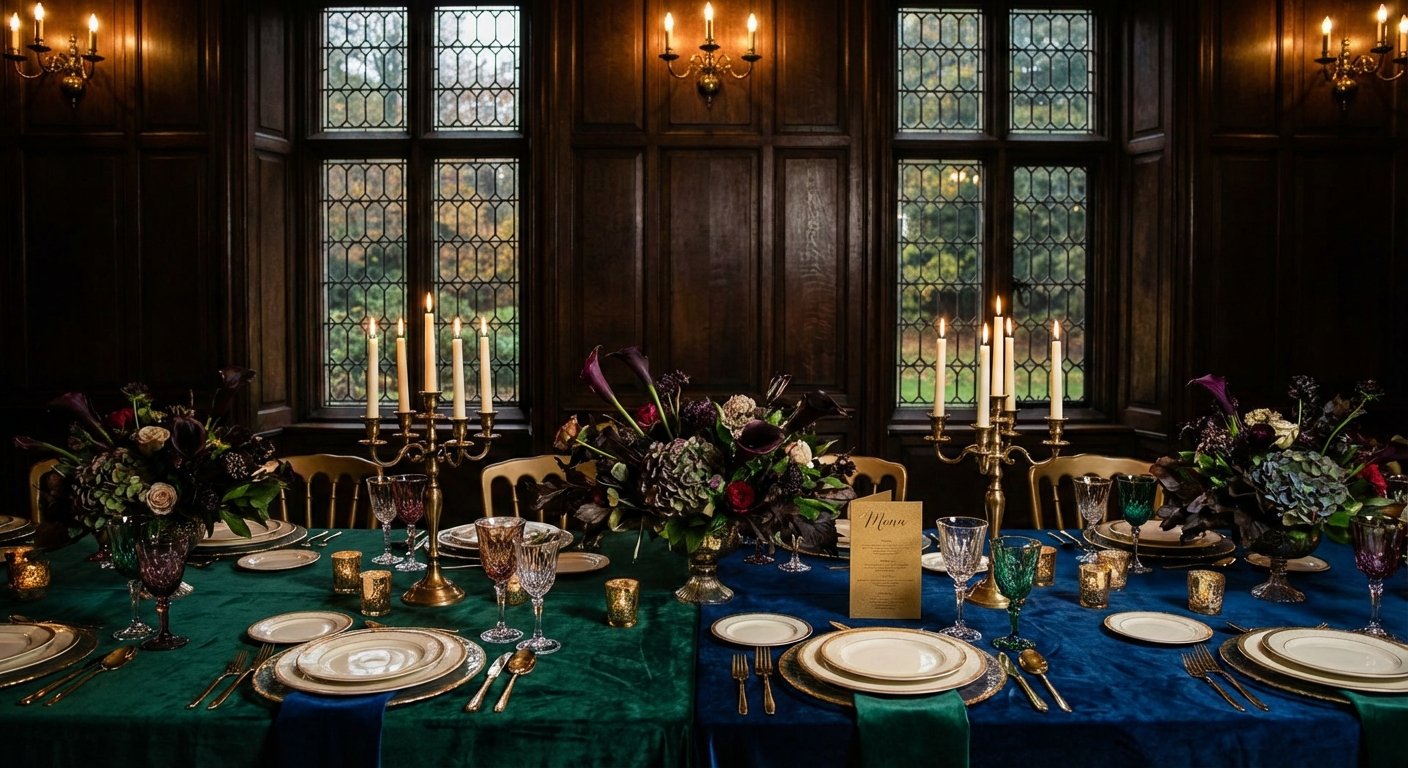
For couples seeking a dramatic and opulent atmosphere, the Emerald & Sapphire Jewel Tones palette offers a breathtaking alternative to more traditional wedding colors. This combination channels the deep, saturated hues of precious gems, pairing rich emerald green and sophisticated sapphire blue with lustrous gold accents and grounding ivory. It’s a bold choice that communicates luxury and confidence, perfect for creating an unforgettable fall or winter celebration.
This palette’s power lies in its depth and modern elegance. Jewel tones are inherently luxurious and create a visually stunning backdrop, especially for evening events where they absorb and reflect light beautifully. This combination feels both timeless and fashion-forward, reminiscent of designs seen in high-end fashion from designers like Marchesa and Carolina Herrera. It's an ideal choice for a formal, black-tie affair or a chic, contemporary wedding.
How to Implement This Palette
To successfully execute this rich palette, focus on balance and strategic placement. Let the deep tones make a statement without overwhelming the space.
Attire: Dress the wedding party in either emerald or sapphire for a powerful, cohesive look, or mix and match for a dynamic effect. A groom can stand out in a sapphire suit or add a touch of emerald with a velvet bowtie. Gold jewelry and accessories will pop against these deep colors.
Stationery: Make a memorable first impression with ivory invitations featuring bold sapphire text and intricate emerald green motifs, accented with shimmering gold foil.
Décor & Florals: Use ivory or cream linens as a neutral canvas. Introduce color with emerald green velvet table runners or sapphire blue water goblets. Florals can feature deep greenery with white anemones or roses, while gold charger plates, cutlery, and candlesticks add warmth and light.
Expert Tip: Balance is key. Use these powerful jewel tones as your main features but ensure there is plenty of neutral space (ivory, white, or cream) to allow the colors to breathe. Strategic uplighting can also enhance the richness of the fabrics and florals.
Find Your Perfect Shades
Ready to embrace these luxurious hues? Explore professionally curated emerald and sapphire combinations on the ItsaYes wedding color palettes page for more inspiration. To craft a personalized version of this opulent theme, use the ItsaYes wedding color palette generator to find exact HEX codes and build a cohesive vision for your vendors within your ItsaYes plan.
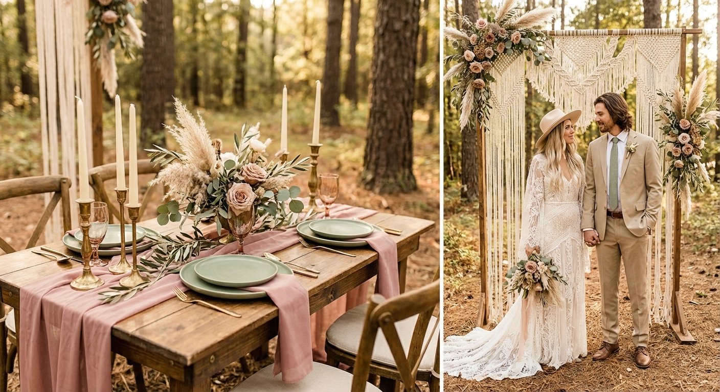
3. Dusty Rose & Sage - Boho Organic Elegance
For couples dreaming of a relaxed yet refined celebration, the Dusty Rose & Sage palette is a perfect match. This combination brings together the muted, romantic tones of dusty rose with the soft, earthy quality of sage green, all balanced by a warm cream neutral. It captures a modern bohemian spirit that feels organic, serene, and effortlessly sophisticated, making it a favorite for outdoor, barn, or rustic-chic weddings in the spring and early fall.
This palette’s appeal lies in its gentle, nature-inspired feel. Unlike brighter color palettes for weddings, these subdued hues create a calming and intimate atmosphere. The colors are inspired by natural landscapes, lending a timeless and authentic quality to your wedding day. They photograph with a soft, ethereal glow, enhancing the natural beauty of any setting from a sun-dappled forest to a minimalist indoor venue.
How to Implement This Palette
To fully embrace the boho-organic vibe, focus on texture and natural materials to bring these muted colors to life.
Attire: Dress bridesmaids in mismatched dresses of dusty rose, sage, and cream. Flowy fabrics like chiffon or linen will complement the relaxed aesthetic. Grooms can opt for a light-colored suit with a sage green tie or a dusty rose boutonnière featuring dried elements.
Stationery: Choose invitations printed on textured, cream-colored paper with minimalist sage green botanical illustrations and dusty rose lettering. This sets a soft, organic tone from the moment guests receive their invites.
Décor & Florals: Combine eucalyptus, olive branches, and other greenery with dusty rose blooms and cream-colored pampas grass. Use wooden tables, linen runners, and matte-finished décor elements like brushed copper or brass candle holders to ground the soft palette.
Expert Tip: Texture is your best friend with this palette. Incorporate different materials like macramé, raw-edged linen napkins, and unfinished wood signage. These tactile details will prevent the muted colors from looking flat and will add depth and interest to your overall design.
Find Your Perfect Shades
Love the earthy elegance of these colors? You can find more dusty rose and sage ideas on the ItsaYes wedding color palettes page or craft your own variation. To visualize how these tones will look together and discover the ideal HEX codes for your vendors, the ItsaYes wedding color palette generator is a great tool. Once you have your palette, you can see how it fits into your overall vision by using an AI wedding moodboard generator to start building a cohesive plan in ItsaYes.
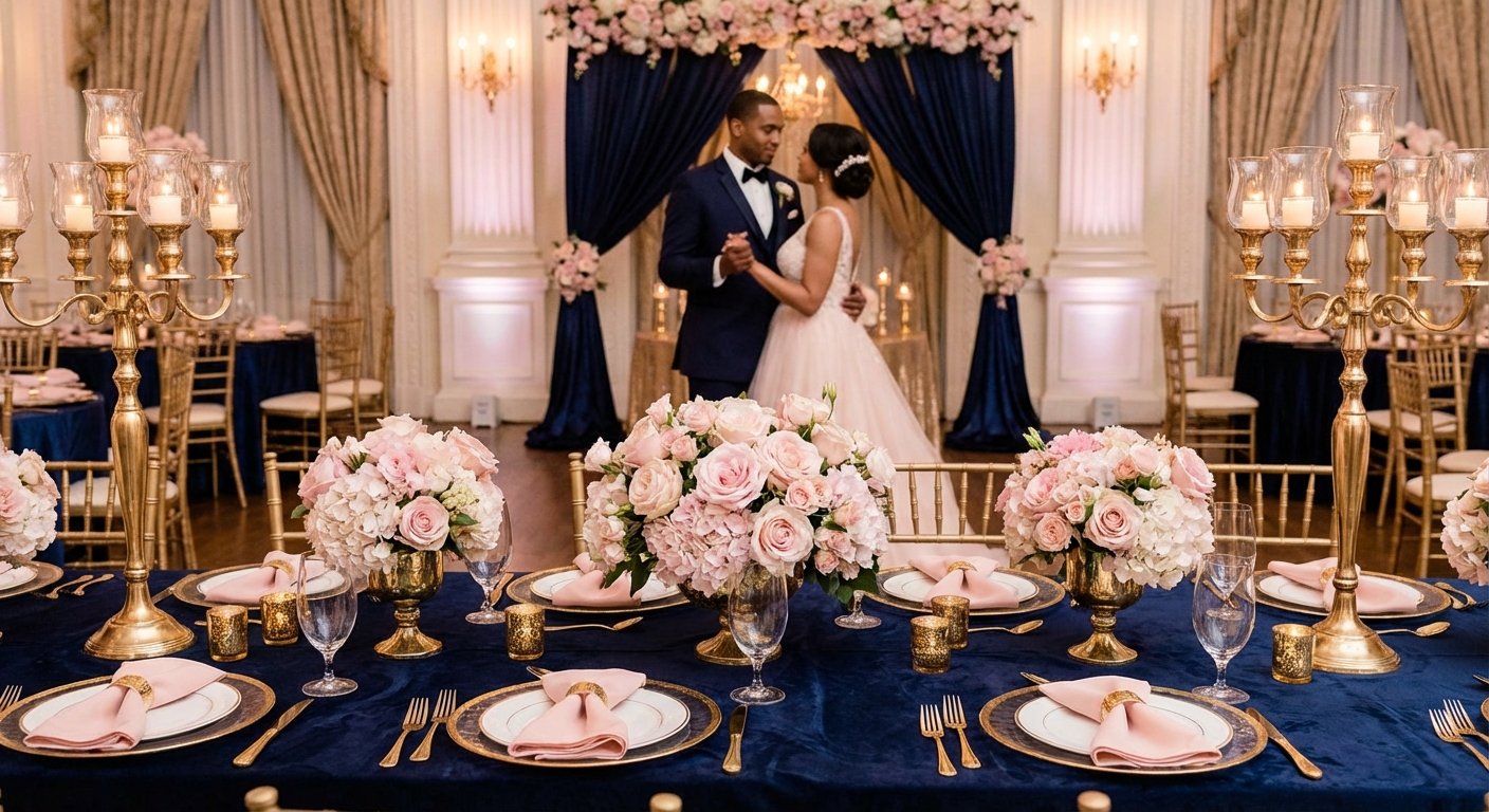
4. Midnight Navy & Blush Gold - Timeless Formal Elegance
For couples seeking a blend of classic sophistication and soft romance, the Midnight Navy & Blush Gold palette is an impeccable choice. This combination pairs the deep, grounding richness of navy with the delicate femininity of blush pink, all elevated by the luxurious warmth of gold accents. It creates an atmosphere of formal elegance that feels both grand and intimate, making it a versatile favorite for year-round celebrations.
This palette’s appeal lies in its powerful yet harmonious contrast. Midnight navy provides a strong, stately foundation that feels confident and timeless, while blush softens the edges with a touch of modern romance. Gold acts as the perfect bridge, introducing light and opulence. As a popular choice among luxury planners and featured in publications like Vogue and Brides, this trio is one of the most enduring color palettes for weddings that aim for refined and polished aesthetics.
How to Implement This Palette
To achieve a balanced and cohesive look, use navy as your anchor, blush as your romantic flourish, and gold as your sparkling highlight.
Attire: Dress the wedding party in elegant midnight navy gowns and suits for a sharp, unified look. The groom can stand out in a classic black tuxedo or a deep navy suit, while blush can be incorporated through floral boutonnières, ties, or pocket squares. Gold jewelry and accessories add the final touch of luxury.
Stationery: Make a memorable first impression with navy invitations featuring delicate blush florals and elegant gold foil calligraphy. This sets a formal and romantic tone for your guests from the very beginning.
Décor & Florals: Use white or ivory linens as a crisp base to make the navy and blush pop. Incorporate navy through napkins or table runners, and let blush shine in lush floral arrangements with roses and peonies. Gold charger plates, flatware, and statement décor like gilded mirrors will catch the light beautifully.
Expert Tip: Leverage lighting to enhance the palette’s warmth. Gold uplighting or an abundance of candlelight can transform a venue, casting a warm, romantic glow that softens the deep navy and makes the metallic accents sparkle throughout the evening.
Find Your Perfect Shades
Ready to embrace this elegant combination? Explore pre-designed navy and blush palettes on the ItsaYes wedding color palettes page to see how these colors work together. To customize the shades for your unique vision, use the ItsaYes wedding color palette generator to find the perfect HEX codes to share with vendors and integrate into your ItsaYes plan.
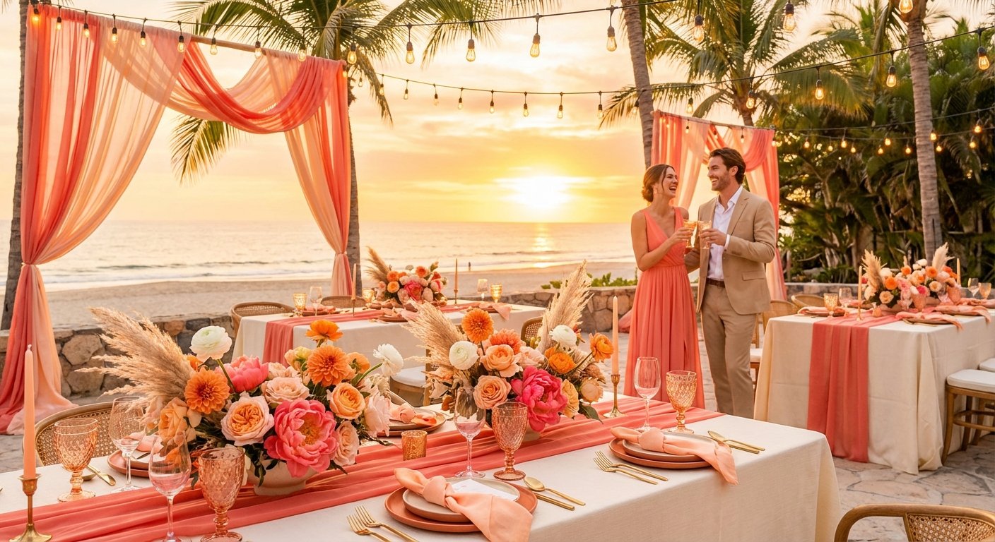
5. Coral & Peach Sunset - Vibrant Summer Warmth
Embodying the glow of a perfect summer evening, the Coral & Peach Sunset palette is a vibrant and energetic choice for the modern couple. This combination blends the joyful intensity of coral with the soft, romantic feel of peach, all grounded by a warm, creamy white. It creates a sun-kissed, optimistic atmosphere that is both playful and sophisticated, making it ideal for summer celebrations and destination weddings.
The strength of this palette lies in its ability to be both bold and inviting. The warm tones are universally flattering and infuse the day with a sense of happiness and energy. It photographs exceptionally well in golden-hour light and creates a memorable, lively backdrop that feels both fresh and elegant, perfectly suited for couples with spirited personalities.
How to Implement This Palette
To master this vibrant look, focus on balance. Use the bolder coral as an accent to let the softer peach and cream tones shine, creating a warm and welcoming environment.
Attire: Dress bridesmaids in flowing peach gowns, which offer a warm and flattering hue for various skin tones. The groom can incorporate a subtle coral boutonnière or tie. Gold or rose gold jewelry will complement the warm tones perfectly.
Stationery: Set a cheerful and elegant tone with cream-colored invitations featuring vibrant coral typography and soft peach watercolor details.
Décor & Florals: Combine peach dahlias, coral hibiscus, and cream-colored roses for stunning bouquets and centerpieces. Use natural wood tables or light-colored linens to make the colors pop. Rattan chargers and gold cutlery can add a touch of tropical elegance.
Expert Tip: Balance is key with such a vibrant color. Use cream or ivory as your dominant base color for linens and large décor elements. This prevents the coral from becoming overwhelming and allows it to serve as a high-impact accent in florals, ribbons, and signature cocktails.
Find Your Perfect Shades
Inspired by this sun-drenched palette? If you want to customize this combination or explore similar options, the ItsaYes wedding color palette generator can help you discover the perfect HEX codes. Once you’ve found your shades, you can easily integrate them into your ItsaYes plan to share a cohesive vision with all your vendors.
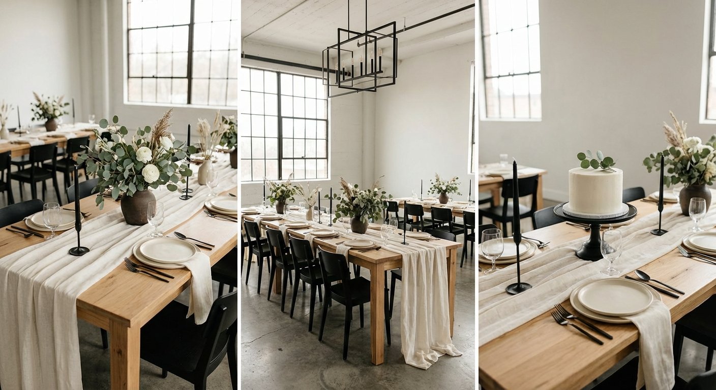
6. Eucalyptus Green & Ivory - Modern Minimalist Organic
For the couple who finds beauty in simplicity, the Eucalyptus Green & Ivory palette offers a clean, organic, and effortlessly modern aesthetic. This combination channels a less-is-more philosophy, relying on the soft, muted green of eucalyptus leaves, the warmth of ivory and cream, and the sharp contrast of minimal black accents. It creates a serene and sophisticated atmosphere rooted in natural elegance, perfect for contemporary, urban, or industrial-chic venues.
This palette’s appeal lies in its intentional restraint and connection to nature. Inspired by Scandinavian and Japanese design principles, it prioritizes clean lines, natural textures, and uncluttered spaces. As one of the most refined color palettes for weddings, it communicates a sense of calm and structure, allowing the core elements of your day to shine without unnecessary ornamentation.
How to Implement This Palette
To successfully execute this minimalist vision, focus on texture, form, and the strategic use of negative space. Let the natural elements lead the design.
Attire: Bridesmaids can wear elegant ivory or cream gowns in modern silhouettes, holding simple bouquets of pure eucalyptus. The groom could opt for a light gray or beige suit, complemented by a black tie and a single eucalyptus boutonnière.
Stationery: Choose high-quality, textured paper in ivory or off-white. Use a clean, sans-serif font in black or dark gray for a modern, typographic feel. A single pressed eucalyptus leaf could be a beautiful, subtle embellishment.
Décor & Florals: Greenery is the star. Use lush eucalyptus runners down the center of bare wooden tables or an architectural arch draped in eucalyptus for the ceremony. Keep linens simple and ivory, and use natural materials like wood chargers and linen napkins to add subtle texture.
Expert Tip: The key to this palette is intentionality. Use black as a purposeful accent, not a main color. Think thin black frames for signage, black-ink calligraphy on place cards, or minimalist black cutlery to provide a grounding contrast to the soft greens and ivories.
Find Your Perfect Shades
Love this clean, organic vibe? Discover curated Eucalyptus & Ivory combinations on the ItsaYes wedding color palettes page to get started. To customize the perfect muted green or find a complementary cream, use the ItsaYes wedding color palette generator to define your HEX codes and build a cohesive plan with your vendors.
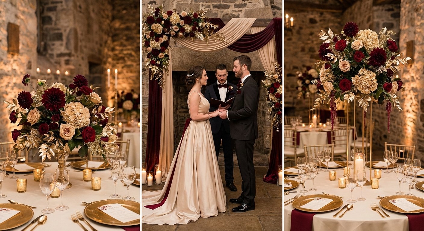
7. Burgundy & Champagne - Elegant Fall Romance
For couples dreaming of an autumn or winter wedding infused with warmth, drama, and sophistication, the Burgundy & Champagne palette is an unparalleled choice. This combination pairs the deep, passionate richness of burgundy with the refined, bubbly warmth of champagne and soft ivory. It creates an atmosphere of luxurious romance and timeless elegance, perfect for formal venues, historic estates, or cozy, candlelit celebrations.
The power of this palette lies in its dramatic yet balanced character. Burgundy provides a strong, emotive foundation that feels both intimate and grand, while champagne introduces a light, celebratory sparkle that prevents the darker tones from feeling too heavy. This is one of the most sought-after color palettes for wedding ceremonies in cooler months because it radiates a sense of cozy opulence and photographs beautifully against fall foliage or a snowy backdrop.
How to Implement This Palette
Success with this palette is all about balance. Let the rich burgundy make a statement while champagne and ivory provide elegant contrast and light.
Attire: Dress bridesmaids in stunning floor-length burgundy gowns, perhaps in a luxurious fabric like velvet or satin. The groom can opt for a classic black tuxedo with a burgundy bowtie or a modern, tailored burgundy suit. Champagne can be woven in through delicate jewelry, beading on the wedding dress, or elegant ties for the groomsmen.
Stationery: Set a sophisticated mood with ivory or cream-colored invitations featuring elegant burgundy calligraphy and subtle champagne or gold foil accents. A burgundy envelope with a champagne-colored wax seal adds a final touch of luxury.
Décor & Florals: Use lush arrangements of dahlias, black magic roses, and amaranthus in deep burgundy hues, softened with ivory roses and champagne-toned greenery. Burgundy linens or velvet runners can create a dramatic tablescape, balanced by champagne-colored charger plates, gold cutlery, and an abundance of candlelight to make the colors glow.
Expert Tip: Texture is your best friend with this palette. Incorporate different materials like velvet, silk, and raw-edged linen to add depth and sophistication. A velvet ring box, a silk ribbon on your bouquet, or a textured table runner can elevate the entire aesthetic.
Find Your Perfect Shades
Ready to embrace these rich and elegant tones? You can explore pre-made burgundy and champagne combinations on the ItsaYes wedding color palettes page or craft a personalized version. To find the exact HEX codes that capture your vision, use the ItsaYes wedding color palette generator and seamlessly integrate them into your ItsaYes plan.
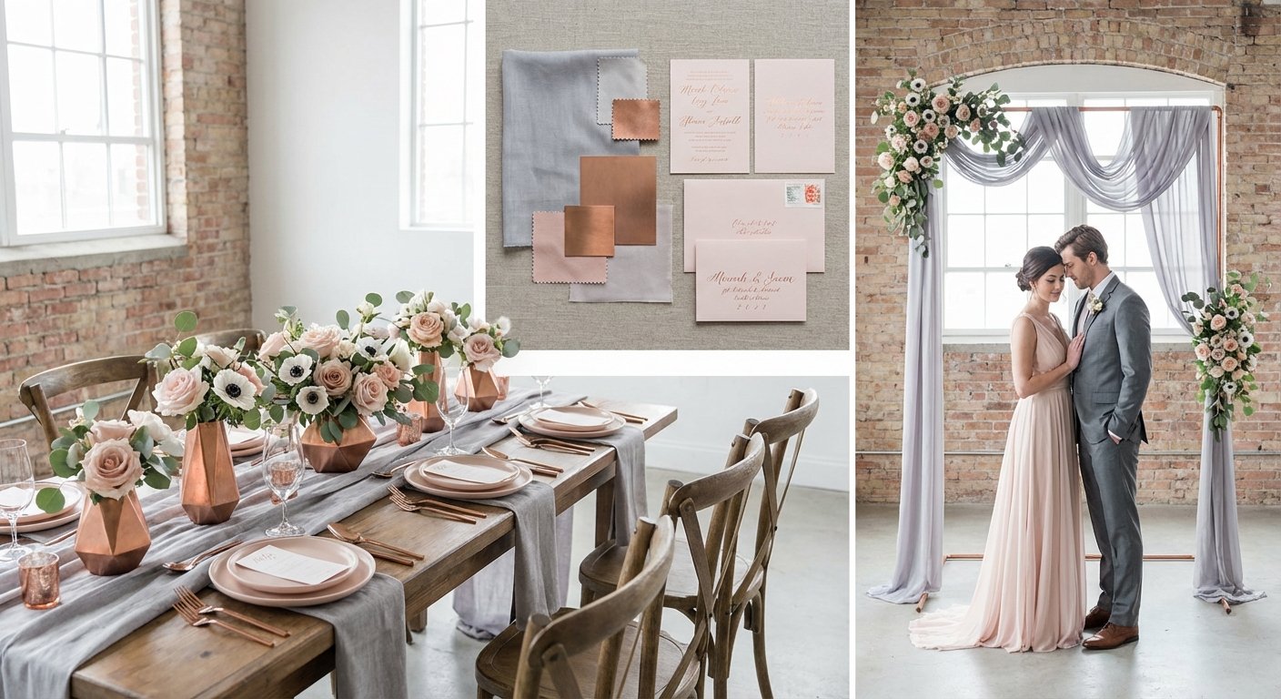
8. Soft Gray & Blush with Copper - Modern Romantic
For the couple seeking a chic, contemporary twist on classic romance, the Soft Gray & Blush with Copper palette is a stunning choice. This sophisticated combination balances the cool, understated elegance of soft gray with the gentle warmth of blush pink. The addition of metallic copper introduces a modern, industrial edge that elevates the entire aesthetic, making it perfect for urban loft weddings or minimalist venues.
This palette’s appeal lies in its modern yet approachable feel. It moves away from traditional, overtly feminine palettes by grounding the romantic blush with a neutral, almost architectural gray. Copper acts as the perfect modern metallic, offering a warmer, more unique alternative to gold or silver. This blend of cool, warm, and metallic tones creates a visually rich and layered experience that feels both curated and effortlessly stylish, making it one of the most forward-thinking color palettes for weddings.
How to Implement This Palette
Success with this palette comes from creating a careful balance between its core components. Use gray as a sophisticated neutral base and layer in the other colors for warmth and impact.
Attire: Dress bridesmaids in elegant soft gray or taupe gowns, which are universally flattering and photograph beautifully. The bride can incorporate blush tones into her bouquet, while the groom can sport a gray suit with a copper tie clip or boutonnière featuring blush accents.
Stationery: Set a modern tone with invitations featuring clean gray typography on high-quality white or blush paper. A touch of copper foil for names or monograms adds a luxurious, contemporary finish.
Décor & Florals: Combine soft blush florals like garden roses with silvery-green eucalyptus and dusty miller. Use gray linens or bare wooden tables as your canvas. Introduce copper through geometric candle holders, charger plates, modern vases, or minimalist signage to create intentional focal points.
Expert Tip: To maintain a modern and uncluttered look, use copper sparingly as a defined accent. Select a few key elements, like your flatware, bar signage, or centerpiece vessels, to feature the metallic. This prevents it from overwhelming the soft, romantic elements of the gray and blush.
Find Your Perfect Shades
Ready to build your modern romantic vision? You can explore pre-made gray and blush combinations on the ItsaYes wedding color palettes page or design a custom variation. To find the exact shades that fit your style, the ItsaYes wedding color palette generator can help you create the perfect set of HEX codes to share with vendors and use in your ItsaYes plan.
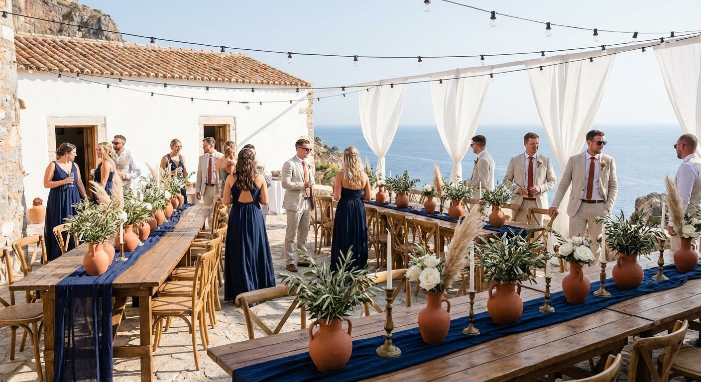
9. Navy & Terracotta - Modern Mediterranean
Evoking the sun-drenched coastlines of Italy and Greece, the Navy & Terracotta palette is a sophisticated choice for couples with a love for travel and organic elegance. This combination pairs the deep, stable grounding of navy blue with the earthy warmth of terracotta and the balancing softness of cream. It creates a worldly atmosphere that feels both refined and wonderfully relaxed, perfect for summer celebrations, outdoor venues, and destination weddings.
The appeal of this palette lies in its rich contrast and natural charm. Navy provides a classic, formal base, while terracotta introduces a rustic, bohemian vibe that is warm and inviting. This blend of styles makes it one of the most unique color palettes for weddings, ideal for couples who want a look that is stylishly curated yet feels effortless and connected to nature. It shines in sunlit outdoor settings and transitions beautifully into a warm, ambient evening.
How to Implement This Palette
To capture the Mediterranean spirit, focus on texture, natural materials, and a balanced distribution of warm and cool tones.
Attire: Dress the wedding party in classic navy for a strong, cohesive foundation. The bride can wear a cream or ivory gown, while the groom can incorporate a terracotta-colored tie or boutonnière featuring dried grasses.
Stationery: Set the scene with invitations that feature navy text on thick cream cardstock, perhaps with a terracotta-colored wax seal or a delicate olive branch illustration.
Décor & Florals: This is where terracotta truly shines. Use earthenware pots, velvet runners, and terracotta-hued napkins on cream-colored linens. Complement these with florals like rust-colored roses, pampas grass, and eucalyptus, and add sprigs of rosemary or olive branches to place settings for an aromatic touch.
Expert Tip: Lean into texture to enhance the palette's organic feel. Incorporate woven placemats, raw silk ribbons, and aged terracotta pottery. These tactile elements prevent the strong colors from feeling flat and add a layer of authentic, rustic sophistication.
Find Your Perfect Shades
Ready to bring a touch of the Mediterranean to your special day? You can browse existing navy and terracotta combinations on the ItsaYes wedding color palettes page or craft your own interpretation. To find the ideal shades of rustic orange and deep blue, use the ItsaYes wedding color palette generator to create a custom palette with HEX codes you can easily share with your wedding vendors and integrate into your ItsaYes plan.
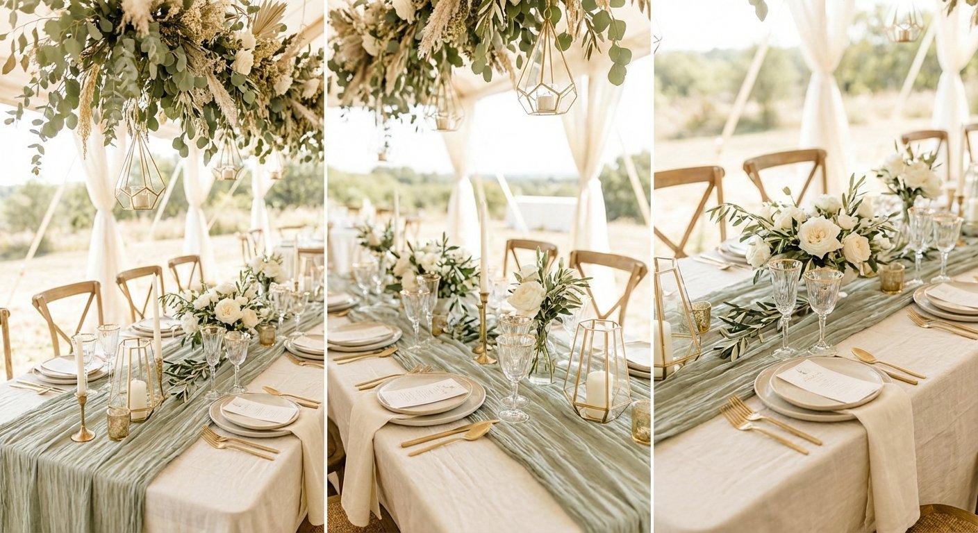
Embodying a sense of calm sophistication, the Sage, Ivory & Warm Gold palette is a gentle, nature-inspired choice perfect for modern organic weddings. This combination pairs the soft, earthy tones of sage green with the clean brightness of ivory, adding a touch of understated luxury with warm gold accents. It creates a serene and inviting atmosphere, ideal for couples who want their day to feel both elegant and grounded.
This palette’s appeal lies in its ability to feel both trendy and timeless. Sage green is a versatile neutral that works beautifully in any season, while ivory provides a soft, warm base. The warm gold introduces a hint of glamour without disrupting the palette’s natural, calming aesthetic, making it one of the most sophisticated color palettes for weddings that prioritize organic elegance.
How to Implement This Palette
To bring this soft and organic vision to life, focus on texture and natural elements to complement the colors.
Attire: Dress bridesmaids in flowing sage green gowns for an ethereal look. Grooms can opt for a light-colored suit with a sage tie or boutonnière. Ivory is the perfect choice for the wedding dress, and warm gold can be incorporated through delicate jewelry, belt details, or elegant hairpins.
Stationery: Set a natural tone with ivory or cream-colored paper featuring sage green botanical illustrations and subtle warm gold lettering. Consider using textured, handmade paper to enhance the organic feel.
Décor & Florals: Use abundant greenery like eucalyptus, olive branches, and dusty miller to highlight the sage tones. Pair them with ivory blooms such as roses, ranunculus, and lisianthus. Ivory linens on wooden tables create a beautiful canvas for sage napkins and warm gold cutlery, chargers, and candlesticks.
Expert Tip: Incorporate natural textures to enhance the organic feel. Think raw linen tablecloths, unpolished wooden signage, and ceramic vases. These elements will add depth and prevent the soft palette from looking flat.
Find Your Perfect Shades
Inspired by this serene and elegant palette? Explore curated sage and gold palettes on the ItsaYes wedding color palettes page or design your own unique combination. The ItsaYes wedding color palette generator is the perfect tool to help you select the exact HEX codes you need to build a cohesive and beautiful plan with your vendors.
Comparison of 10 Wedding Color Palettes
Palette
Implementation Complexity 🔄
Resource Requirements ⚡
Expected Outcomes ⭐📊
Ideal Use Cases
Key Advantages 💡
Romantic Blush & Gold — Spring/Summer Romance
Low–Moderate: straightforward color pairing, needs balance to avoid cliché
Moderate: common florals & gold rentals; book 6–9 months
Calming, eco-friendly, highly adaptable and photographable
From Inspiration to a Flawless Plan: Your Next Steps
You've explored a gallery of stunning color palettes for wedding celebrations, from the soft romance of Dusty Rose & Sage to the dramatic luxury of Emerald & Sapphire jewel tones. Each combination offers a unique blueprint for telling your story, setting the mood, and creating a cohesive, memorable experience for you and your guests. The journey from a single spark of inspiration to a fully realized wedding vision is one of the most exciting parts of planning.
The key takeaway is that your color palette is more than just a set of pretty shades; it's the foundational design language for your entire event. It dictates the flowers you choose, the texture of your linens, the ink on your invitations, and the hue of your bridesmaids' dresses. Understanding how to apply these colors, from the dominant shades to the subtlest accents, is what transforms a good idea into a breathtaking reality. Remember, consistency is what creates that polished, professionally designed look.
Making the Palette Your Own
The palettes presented in this article, like the timeless Midnight Navy & Blush Gold or the modern Eucalyptus Green & Ivory, are starting points, not rigid rules. The most impactful wedding designs feel deeply personal. Don't be afraid to experiment and customize what you've seen here.
Swap a Shade: Love the Burgundy & Champagne palette but want something a bit brighter? Swap the champagne for a warm, shimmering gold to add more vibrancy.
Adjust the Ratios: Prefer a more minimalist look? Take the Soft Gray & Blush with Copper palette and use gray as 80% of your design, with blush and copper appearing only as delicate, intentional accents.
Combine and Conquer: Feel drawn to two different styles? You can borrow elements from each. Perhaps you love the organic feel of Sage, Ivory & Warm Gold but want the modern edge of Navy & Terracotta. A skilled florist or designer can help you merge these ideas into a unique, harmonious vision.
Key Insight: Your final palette should feel like an authentic reflection of your relationship. If you're a vibrant, energetic couple, a muted, neutral palette might not capture your essence, no matter how trendy it is. Trust your instincts and choose colors that bring you joy.
Your Actionable Next Steps to a Cohesive Design
Feeling inspired is wonderful, but turning that inspiration into a concrete plan is what matters most. Moving from a Pinterest board to a step-by-step project plan can feel overwhelming, but breaking it down into manageable actions is the key to clarity and confidence.
Finalize Your Top 1-2 Palettes: Narrow down your choices. Save your favorite combinations and look at them in different lighting and contexts.
Create a Mood Board: Go beyond just color swatches. Gather images of flowers, fabrics, textures, and real-world examples that use your chosen colors. This visual guide will be invaluable when communicating with vendors.
Explore More Options: If you're still searching for the perfect combination, visit our curated wedding color palettes page for even more ideas. For a truly custom approach, experiment with our interactive wedding color palette generator to build a scheme from scratch that is 100% you.
Translate Color into a Plan: Once you have your colors, the real work begins. You need a system to track how this palette will be implemented across every decision, from your save-the-dates to your reception décor, ensuring everything aligns with your budget and timeline.
This final step is where a simple spreadsheet or a scattered collection of notes can quickly become chaotic. A successful wedding plan requires connecting your visual inspiration directly to your tasks, vendors, and budget in one organized, central hub.
Ready to turn your perfect color palette into a perfectly executed plan? ItsaYes is an AI-powered wedding planning system that transforms your vision into a calm, intuitive, and step-by-step roadmap. Move beyond scattered ideas and bring your color scheme, tasks, and timeline together in one beautiful workspace. Start planning with clarity on ItsaYes today.